Clearer service pages
Rewrite and structure pages so visitors understand what you do, who you help, and why it matters.
Law Firm Website Design · Malaysia
If your legal website looks professional but enquiries are slow, the issue is rarely beauty. It is clarity, trust, law firm SEO basics, and whether the next step feels safe to take.
Free 15-minute website review · No obligation, no pressure.
Visitors understand your practice, credibility, and next move without feeling overwhelmed.
Before visitors enquire
A legal visitor is not browsing casually. They are deciding whether your firm feels credible enough to contact and simple enough to start with.
Visitors should know within seconds whether your firm helps with their exact legal problem.
Profiles, credentials, practice focus, and proof need to appear before hesitation sets in.
A calm, clear process reduces fear and makes the first contact feel easier.
The next step should feel direct, low friction, and visible without searching.
What gets improved
The goal is not to make a louder website. It is to make the important legal decision feel clearer for the right visitor.
Rewrite and structure pages so visitors understand what you do, who you help, and why it matters.
Bring lawyers, experience, practice areas, proof, and reassurance into the page at the right moment.
Make contact options, consultation prompts, and the next step visible without forcing visitors to think.
Support commercial-intent searches such as law firm website design Malaysia, legal website redesign, lawyer website design, and consultation enquiry pages.
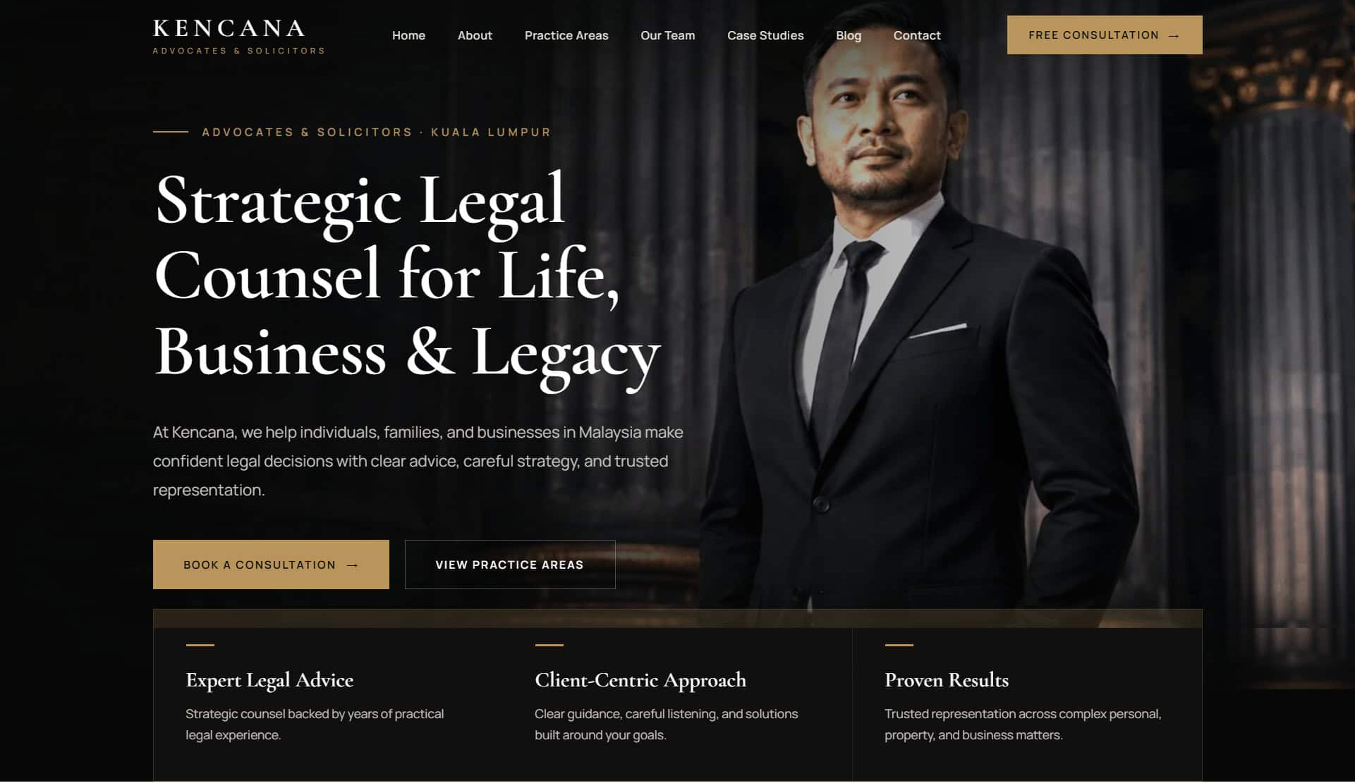
Real legal website directions
A corporate practice, a boutique firm, a local advisory firm and a personal-brand lawyer should never look the same. The website has to match the way each firm's clients actually decide.
Pick the firm closest to yours, then see the direction we would take it in.
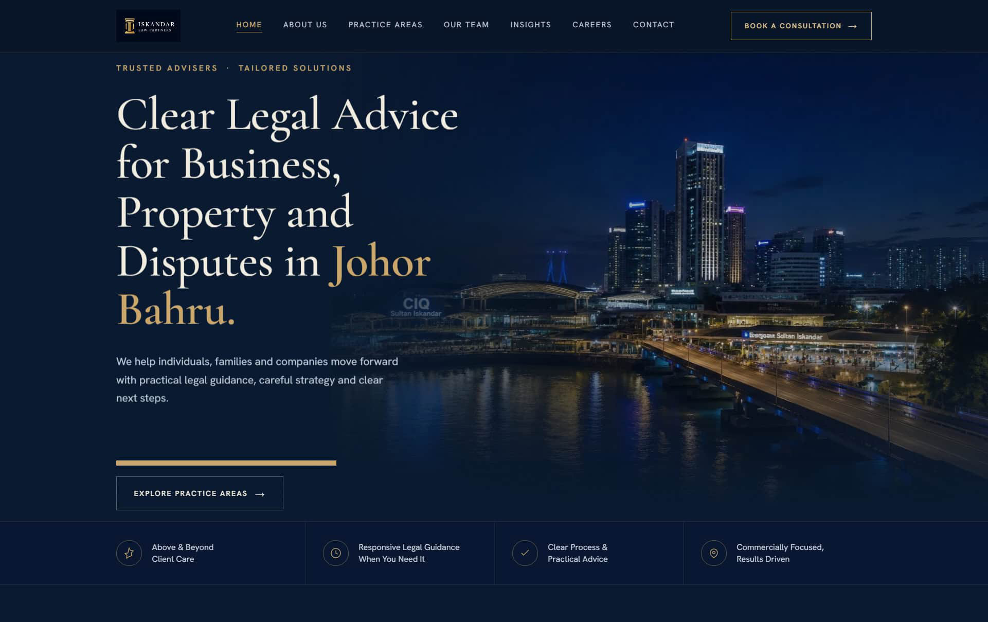
The corporate practice
01 / 04Capable, but visitors have to work to figure out what the firm actually does.
Clear practice focus and a confident, city-grade first impression on load.
Built for conversion
The difference is not just visual polish. It is whether the visitor can move from uncertainty to confidence without getting lost.
The framework
A strong law firm website does not need to say everything at once. It needs to answer the right questions in the right order.
The visitor sees their situation reflected clearly and knows they are in the right place.
Experience, lawyers, practice focus, and proof reduce hesitation.
Practice areas become easier to scan, compare, and understand.
Visitors know what happens after they enquire and why starting is safe.
The contact step is visible, direct, and written in a way that feels calm.
How the review works
No jargon, no hard sell — just a practical, honest look at what is quietly stopping serious clients from picking up the phone.
Send your link and the kind of clients you would like more of. Two minutes — that is all I need to begin.
I move through your site the way a prospective client does: clarity, trust, mobile flow, search basics and the path to enquire.
A short, ranked list of what is quietly costing you enquiries — what to fix first, and what can safely wait.
Apply the advice yourself, or have me handle it for you. No pressure and no obligation, ever.
Questions law firms ask
Straight answers about the review, redesign work, and what happens next.
Free website review
Send me your law firm website. I'll show you the first few changes that make it clearer, easier to trust, and simpler to contact — in plain language, with no obligation.
100% free No pushy sales Reply within 1 business day